Stuck for Ideas? Check out these inspiring reads.
It all begins with an idea.
The Unusual Podcast list of inspiring books on creativity that are ideal to dip in and out of, and perfect gift ideas.
How to have great ideas by John Ingledew
A rich and nicely illustrated collection of strategies, methods and ways to approach idea generation, creative thinking and problem solving. Some of my personal favourites include going for walks and searching for ‘visual treasures’ in your surroundings. This was a fun activity I even did with my kids to hone their observation skills. I also love the idea of learning to write and tell jokes as a shortcut to think creatively.
Creativity, A short and cheerful guide by John Cleese
I didn’t expect this little book to be so insightful. Backed by science and his own experiences, Cleese succinctly explains some of the intuitive feelings a lot of us may have about creativity.
His insight on the creative mindset is that people are either in an ‘open’ or ‘closed’ state of mind. The closed mode enables us to apply ourselves to tasks with vigour and concentration; the open mode is more relaxed and conducive to mind wandering. Cleese demonstrates how the unconscious mind works on stuff all the time, without us being consciously aware of it. Furthermore, he demonstrates how the language of the unconscious is not verbal, but images and feelings.
This is a great read for anyone to really understand the creative mind and its nuances such as the role of play, time, space and making mistakes. It would make a great gift to a colleague or manager who claims creativity isn’t relevant or who doesn’t appreciate creativity requires certain conditions to thrive.
Another great resource is John Cleese talk on creativity in management.
The Creative Nudge. Simple Steps to help you to think differently. Mick Mahoney and Kevin Chesters
This is a fun book based on the premise that you can’t teach people how to be creative, you can only teach them how not to be creative (a belief held by Sir Ken Robinson in his famous TED talk). Our brains default mode is working with what we know which is counterintuitive to exploring new ideas and challenging the status quo. “A nudge is a little change to our behaviour or thought patterns that can have a disproportionately large impact on an outcome.”
The book contains nine behaviours to rediscover our creativity. I like the science part that introduces each nudge. This would work well in a context where leaders or individuals want practical, easy to implement daily actions to nurture creativity.
The Art of Creative Thinking. Rob Judkins
As stated by the author upfront, this book is not meant to be read in a linear way. When your creativity is running low or you feel the need for inspiration, you can open any page at random. It is a delightful little book full of stories drawing from a range of reference points from Dali and The Beatles to Philippe Starck and James Dyson. Each chapter is a short story about a well-known inventor and his/her process, demonstrating the complexities and failures that come with the creative process and learnings that can be extracted and applied.
This is definitely a keeper for the bookshelf to dig in and out of.
A Smile in the Mind. Witty thinking in graphic design by Beryl McAlhone & David Stuart.
The advertising industry has a lot to teach us about creativity. This book is a collection of over 1,000 eye-catching and thought-provoking instances of visual communication in posters, packaging and data visualization, as well as examples of wit in digital, retail, arts and culture.
It is a delight to dip into because it centres on wit and humour, demonstrating the tools and tricks designers use to create ‘a smile in the mind’ and why this is such an effective way of forming a connection with the viewer. This timeless classic is bound to lead to many ‘ah ha’ moments.
Getting to Know Yeah Yeah Chloe
It all begins with an idea.
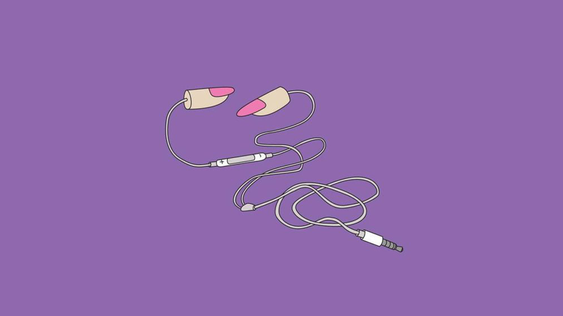
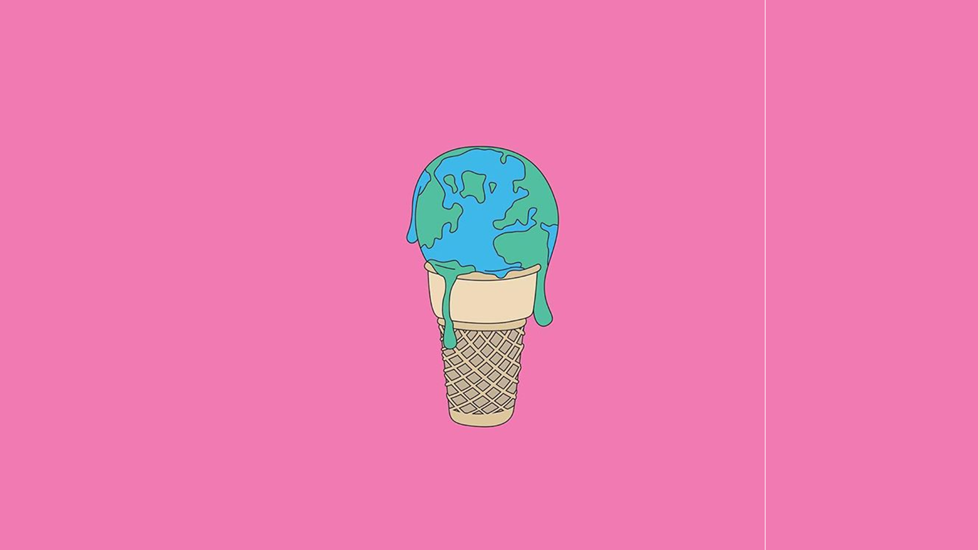
YeahYeahChloe shares more about herself, her teaching style and advice to young visual communicators.


You have this amazing style of combining unusual elements to create something completely new, often communicating a powerful message. How have you trained yourself to think this way?
Thank you! I don’t know if it is something that I intentionally trained myself to do, to be honest. I think it’s more just a manifestation of how I see things – how I make connections and make sense of the world.
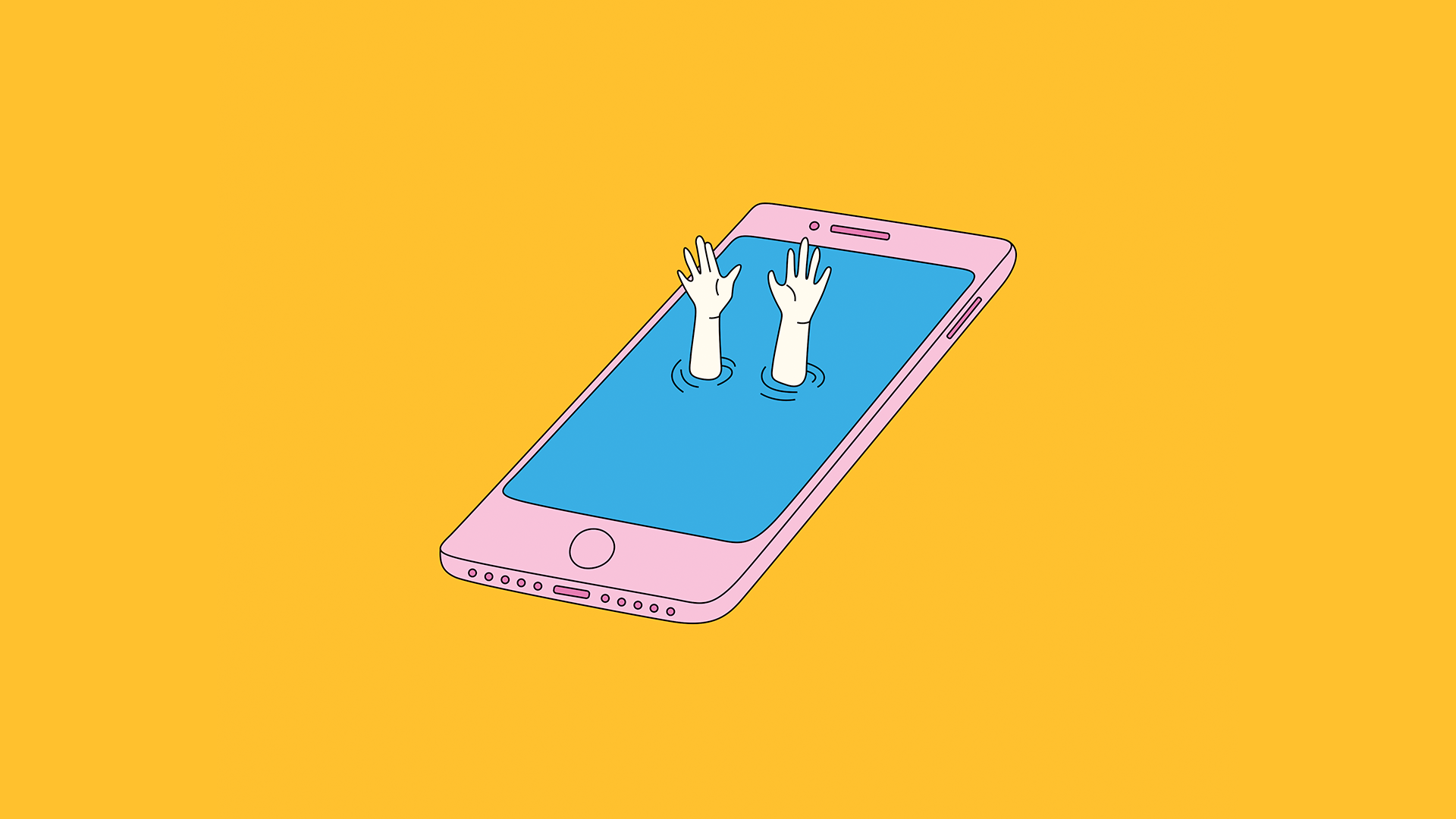
Where did you get the idea for the drowning hands and iPhone image?
I was just feeling like I was spending too much time on my phone and drowning in content. It was all self-inflicted.
Did you study art or graphic design?
I did a Bachelor of Visual Arts, majoring in sculpture.
You are an art teacher, what is your teaching style?
It probably depends on who you ask. I would like to think I was pretty free-range – lots of room for experimentation and for the kids to find where they fit in the art world. I tried to make the units pretty self-directed. I think I probably had very high expectations…I always wanted more from them ‘cause I always knew they had more to give - especially from the older grades – but they always rose to the challenge. If you ask the kids though, they might have a different idea of it.
How important a role does technology play in the creation and promotion of your work?
Oh, it’s central. From the creation of work to subject matter to how I built an audience. My work would not be what it is today and I don’t think I would have been able to have the same opportunities I have had without it.
What advice would you give to aspiring young visual communicators?
Create works that you get some kind of kick out of. You might not be able to do this all the time – I mean I know sometimes you just have to do a job cause it’s a job, but I think this is a good place to always come back to.
More from YeahYeahChloe
WEBSITE
Visual Storytelling with Matt C. Stokes
It all begins with an idea.
Matt Stokes shares how he creates such vibrant scenes that feel alive, and why his characters are often blue.
Where do you get the idea for all those amazing details?
Well, I normally get a brief about the subject matter for an illustration that starts my brain going. I'll jot everything down or make quick thumbnails of bits I want to include. It is great when there is a general theme or feeling being asked for, not 'draw a specific person driving an exact car doing a particular thing'. An example of a general theme is being the subject of an illustration I've done that I think has ended up quite successful is Create in Brighton, or maybe Ballot Scotland - both location-specific and sort-of aspirational-theme-specific.
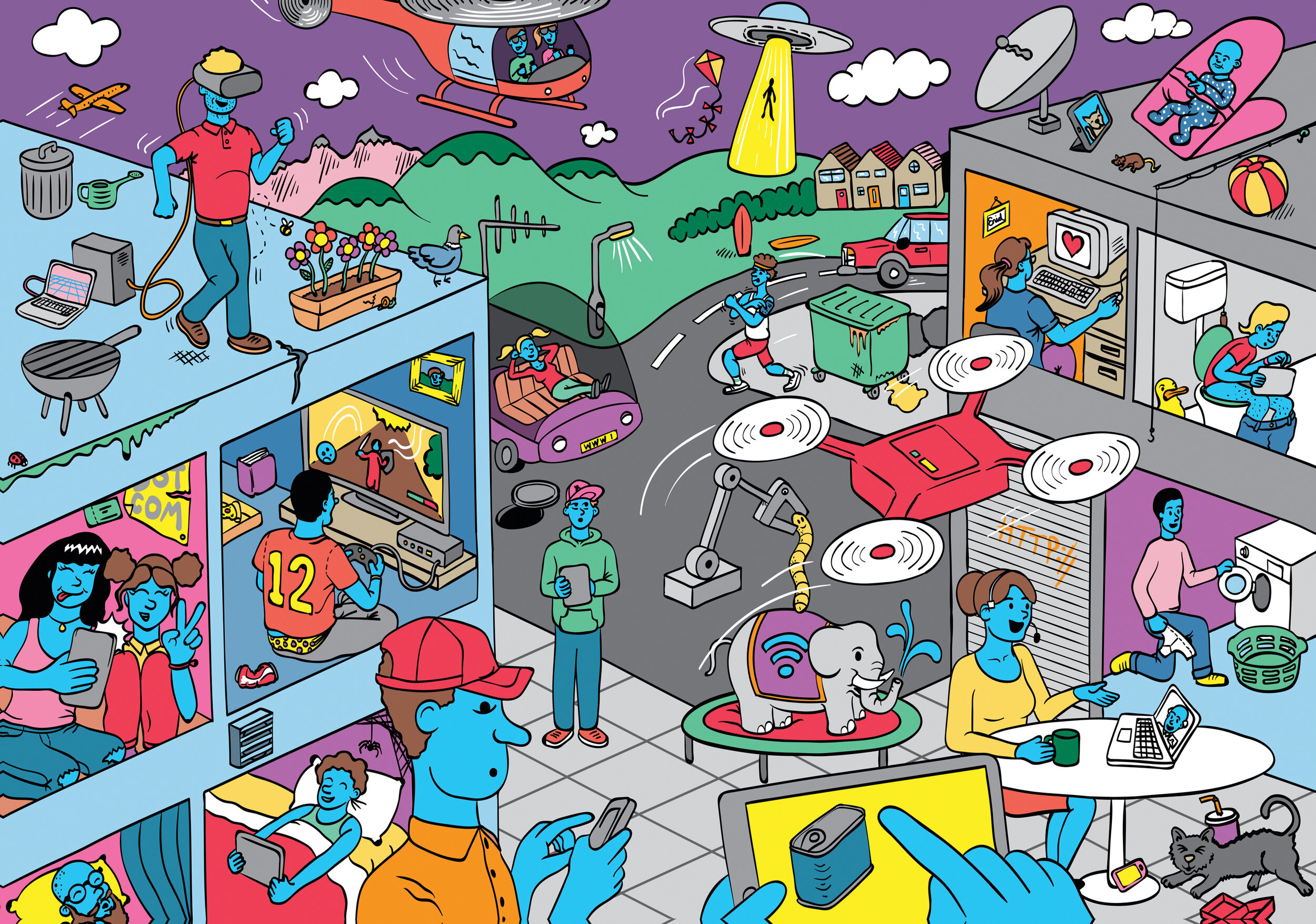
Generally, I have sketchbooks on the go, otherwise "important paperwork" ends up being dedicated to (read: defaced with) biro doodles of things that occur to me to include, or aspects I want to convey in an image. In the case of the Internet image for Eyeyah!, there was a general brief of a landscape with uses of the internet littered around it (and the format of the activity was being defined as I was doing the work as well - important to say) so I kept a list of ways the internet is being used that would seem mad to people if they were from another planet. I like reading Wired and New Scientist and things like that, so a few little details immediately came to mind like those little buttons being manufactured that you stick on your washing machine so that when you run out of washing powder, you hit the button at that point, and it puts detergent in your basket on your Amazon or Sainsbury's account - whatever you've set up, coz you won't remember when you're in front of a computer or in the shop. Little things like that stick in my mind that end up in illustrations later. Some of the uses of the internet were quite standard (Skype/VOIP), but I wanted to include ones like the woman at a computer with heart, as if she was finding love on the internet, and a person using a drone. And the person running - tracking their run on the internet, as this is something I do. There are other more hidden quirky things like the spider web behind the foreground guy's head - because it is 'the web', and the worm because you get worm viruses on computers, a fishing rod for phishing, someone defecating for 'downloading' Spam (no explanation necessary), the manhole because you can go down a hole on the internet, junk-food litter here and there because you're exposed to so much junk. There is a reason everything is there. And I am probably pushing my own idea, my own perception of what the internet is subtly (to children of all people!). The baby watching the iPad on the roof is my daughter, she was that age at the time, but we didn't let her watch TV nor sit so close to the edges of tall buildings
I do have a tendency to fill illustrations with things that make me laugh, and little in-jokes or things that no one else would get. Just for my own amusement/sanity. Like whenever I'm doing big batches of illustrations for e-learning projects and we need several people, I'll draw me, my wife, stuff like that. If I have to add a name somewhere, it is from whatever trash 60s sci-fi I'm reading at the time. A date? My birthday probably (FYI NOT my pin). Some of it comes from boredom (I had a job drawing mattresses once - who DOESN'T want to fall asleep when drawing mattresses!) - so if there's an opportunity to throw something a bit fun in, even if just for my benefit, I'll do it.
Why are the characters blue?
Basically - in a nutshell - it is down to ethnicity. I don't want people to be put off thinking: those people aren't me, because they don't share the same exact skin colour. Making them blue solves this.
In a more negative light, I have memories of an infuriating marketing manager on one of my first freelance jobs saying that a group of people I'd illustrated needed to look more "ethical" (not a typo - they would say 'ethical' meaning - I weeded out of them - that they needed to have a more diverse set of people in the illustrations). Looking at the set I was proposing (I think they were ALL based on photos of me and my wife who both happen to be white), and irritatingly they were right. This moron who couldn't use language properly (let alone commission illustration) had a point: that the diversity of the group needed to be addressed. So, I learnt the hard way, and think back about this anecdote begrudgingly as this person was a nightmare, but they were right about something important.
Making the people blue eradicates the feedback you get saying "can we change it as we need to include a Black person, or an Asian person" or feedback that is the result of a boardroom arguing over why they should or shouldn't be using a black person as the key subject in an image (true story - happened), and avoids me having to choose which ethnicity is doing what job. Am I or the art director going to accidentally make the white male the millionaire boss, and the black female the person cleaning the floor? Am I going to exercise a subconscious bias that says something about the company I'm working/promoting in an illustration?
I don't want people to be concentrating on the skin tone of the characters, but instead of what they're doing. I think I did it at first thinking about the 80s cartoon Ulysses 31 - they had this species of people that were all blue, and I liked that. I've borrowed I suppose.
What are some tips for aspiring visual communicators?
Err…keep on keepin' on? You're not going to find a good way of working and get faster and more confident unless you're practicing. You're not going to be a visual communicator unless you're communicating visually, or at least aspiring to!
Regarding style - I don't feel I've ever had one, as the brief defines the style. I've done lots of different stuff, and don't tend to do every illustration in the same style, such as Jon Bergerman or Tom Gauld, for an example. I have whole catalogues of stuff in different styles that doesn't go on the website for copyright reasons in the end (or I don't think it is successful). I find myself going through old hard drives and remembering stuff and being like 'I don't remember doing that'. I don't think aspiring visual communicators should get hung up on having a style, as often some render styles can go out of fashion. (Out of style even!)


