Visual Storytelling with Matt C. Stokes
Matt Stokes shares how he creates such vibrant scenes that feel alive, and why his characters are often blue.
Where do you get the idea for all those amazing details?
Well, I normally get a brief about the subject matter for an illustration that starts my brain going. I'll jot everything down or make quick thumbnails of bits I want to include. It is great when there is a general theme or feeling being asked for, not 'draw a specific person driving an exact car doing a particular thing'. An example of a general theme is being the subject of an illustration I've done that I think has ended up quite successful is Create in Brighton, or maybe Ballot Scotland - both location-specific and sort-of aspirational-theme-specific.
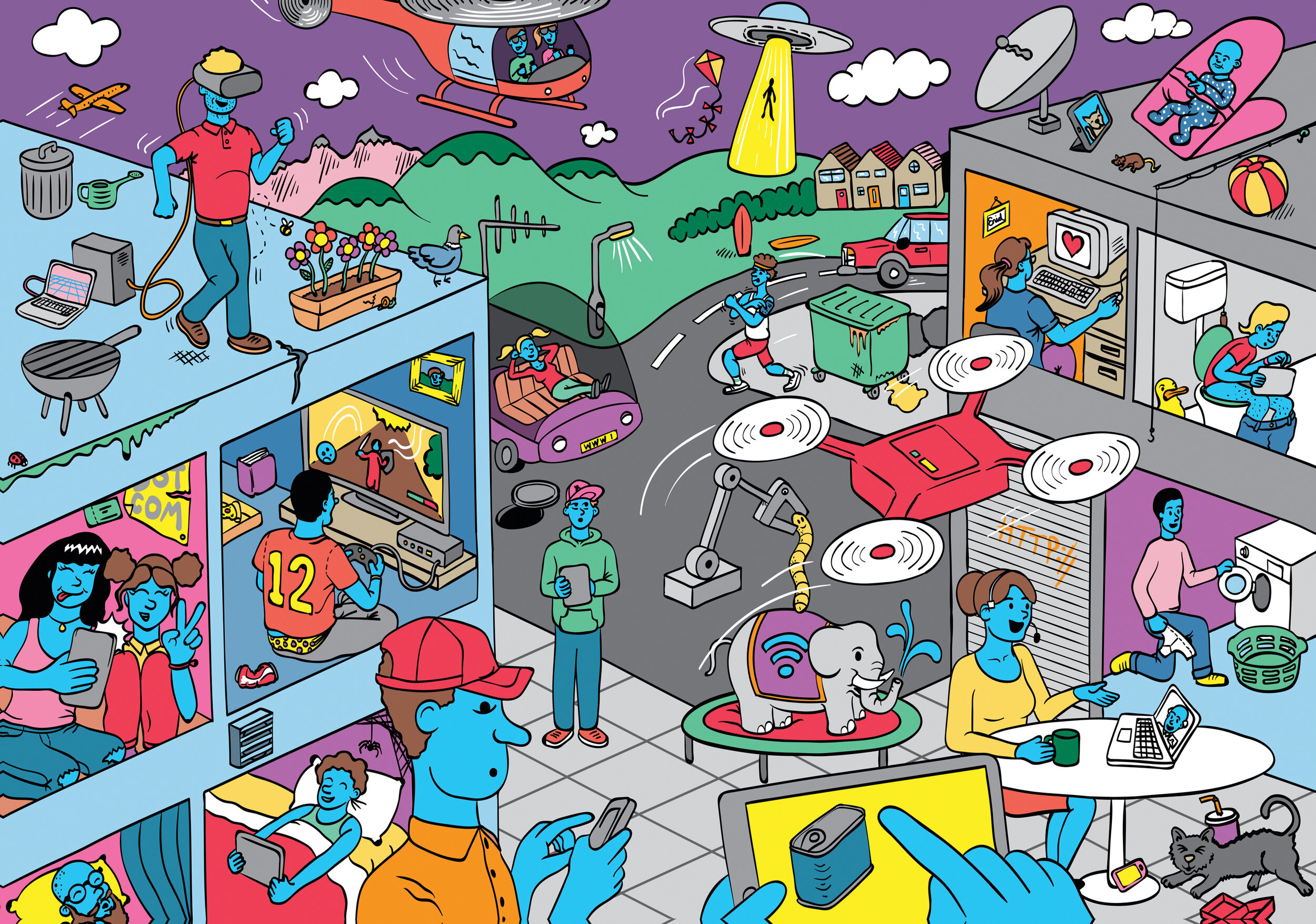
Generally, I have sketchbooks on the go, otherwise "important paperwork" ends up being dedicated to (read: defaced with) biro doodles of things that occur to me to include, or aspects I want to convey in an image. In the case of the Internet image for Eyeyah!, there was a general brief of a landscape with uses of the internet littered around it (and the format of the activity was being defined as I was doing the work as well - important to say) so I kept a list of ways the internet is being used that would seem mad to people if they were from another planet. I like reading Wired and New Scientist and things like that, so a few little details immediately came to mind like those little buttons being manufactured that you stick on your washing machine so that when you run out of washing powder, you hit the button at that point, and it puts detergent in your basket on your Amazon or Sainsbury's account - whatever you've set up, coz you won't remember when you're in front of a computer or in the shop. Little things like that stick in my mind that end up in illustrations later. Some of the uses of the internet were quite standard (Skype/VOIP), but I wanted to include ones like the woman at a computer with heart, as if she was finding love on the internet, and a person using a drone. And the person running - tracking their run on the internet, as this is something I do. There are other more hidden quirky things like the spider web behind the foreground guy's head - because it is 'the web', and the worm because you get worm viruses on computers, a fishing rod for phishing, someone defecating for 'downloading' Spam (no explanation necessary), the manhole because you can go down a hole on the internet, junk-food litter here and there because you're exposed to so much junk. There is a reason everything is there. And I am probably pushing my own idea, my own perception of what the internet is subtly (to children of all people!). The baby watching the iPad on the roof is my daughter, she was that age at the time, but we didn't let her watch TV nor sit so close to the edges of tall buildings
I do have a tendency to fill illustrations with things that make me laugh, and little in-jokes or things that no one else would get. Just for my own amusement/sanity. Like whenever I'm doing big batches of illustrations for e-learning projects and we need several people, I'll draw me, my wife, stuff like that. If I have to add a name somewhere, it is from whatever trash 60s sci-fi I'm reading at the time. A date? My birthday probably (FYI NOT my pin). Some of it comes from boredom (I had a job drawing mattresses once - who DOESN'T want to fall asleep when drawing mattresses!) - so if there's an opportunity to throw something a bit fun in, even if just for my benefit, I'll do it.
Why are the characters blue?
Basically - in a nutshell - it is down to ethnicity. I don't want people to be put off thinking: those people aren't me, because they don't share the same exact skin colour. Making them blue solves this.
In a more negative light, I have memories of an infuriating marketing manager on one of my first freelance jobs saying that a group of people I'd illustrated needed to look more "ethical" (not a typo - they would say 'ethical' meaning - I weeded out of them - that they needed to have a more diverse set of people in the illustrations). Looking at the set I was proposing (I think they were ALL based on photos of me and my wife who both happen to be white), and irritatingly they were right. This moron who couldn't use language properly (let alone commission illustration) had a point: that the diversity of the group needed to be addressed. So, I learnt the hard way, and think back about this anecdote begrudgingly as this person was a nightmare, but they were right about something important.
Making the people blue eradicates the feedback you get saying "can we change it as we need to include a Black person, or an Asian person" or feedback that is the result of a boardroom arguing over why they should or shouldn't be using a black person as the key subject in an image (true story - happened), and avoids me having to choose which ethnicity is doing what job. Am I or the art director going to accidentally make the white male the millionaire boss, and the black female the person cleaning the floor? Am I going to exercise a subconscious bias that says something about the company I'm working/promoting in an illustration?
I don't want people to be concentrating on the skin tone of the characters, but instead of what they're doing. I think I did it at first thinking about the 80s cartoon Ulysses 31 - they had this species of people that were all blue, and I liked that. I've borrowed I suppose.
What are some tips for aspiring visual communicators?
Err…keep on keepin' on? You're not going to find a good way of working and get faster and more confident unless you're practicing. You're not going to be a visual communicator unless you're communicating visually, or at least aspiring to!
Regarding style - I don't feel I've ever had one, as the brief defines the style. I've done lots of different stuff, and don't tend to do every illustration in the same style, such as Jon Bergerman or Tom Gauld, for an example. I have whole catalogues of stuff in different styles that doesn't go on the website for copyright reasons in the end (or I don't think it is successful). I find myself going through old hard drives and remembering stuff and being like 'I don't remember doing that'. I don't think aspiring visual communicators should get hung up on having a style, as often some render styles can go out of fashion. (Out of style even!)